***
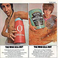
In 1967, Peter Blake, the most celebrated and successful of the four artists featured in Ken Russell’s Pop Goes the Easel, made a spectacular leap into the world of pop music designing (with his wife, American-born artist Jann Haworth) the dense, allusive cover art for Sgt. Pepper’s Lonely Hearts Club Band. At a time when the price tag for album art was about $100, Blake’s frameworthy, gallery-ready effort cost closer to $5,000. It was a work of art surrounding a work of art – at least that’s how Blake, the Beatles, and producer George Martin imagined it – an LP cover that further distanced the (now facially hirsute) Beatles from their pop band beginnings, announcing that a serious artistic statement was inside. Pete Townshend, Kit Lambert, and Chris Stamp envisioned Sell Out having a similar conceptual consistency, one that began with a pop art cover that aggressively and unapologetically celebrated hype – a creative assignment taken on by designers David King and Roger Law. King was a graduate of the London School of Printing and Graphic Arts, and from 1965-1975 was art editor of the Sunday Times Magazine. It was while at the magazine that he developed his trademark technique of cropping photos to accentuate their dynamism, along with the use of processed graphic effects that, according to art critic Christopher Wilson, "gave the magazine a cinematic feel." Cambridge educated Law (who would later go on to international success in the 80s with the political satire puppet show Spitting Image), had been employed as an illustrator for the satirical magazine Private Eye, and contributed political cartoons to the Observer. Sell Out was not his first rock album cover, he’d created the beautifully detailed artwork gracing the Jimi Hendrix Experience’s Axis: Bold as Love. The job of photographing the Who fell to Brooklyn-born expatriate David Montgomery, who would go on to be one of England’s most celebrated portrait photographers, and remains perhaps the only person on record to refer to the Who as acting like "[a group] of very good schoolboys on a day trip."
The finished effort was the opposite of Peter Blake’s gorgeously crafted, somber artistry. Sell Out’s oversized photos, in the pop art tradition of emphasizing advertising’s vulgarity, burst forth from their frames screaming, "Buy this, now!" Townshend, fingers torn and frayed from enthusiastic auto-destruction, clutches a comically outsized container of Odorono, a knowing grin expressing his pleasure at this intensely referential pop art joke. Keith Moon, managing to look contrite and embarrassed, salves an enormous pustule with an equally large tube of Medac (changed to Clearasil in Australia). John Entwistle, his underdeveloped body clad in faux leopard skin, face plastered with an atypically goofy grin, clutches a teddy bear in his left hand, while his right arm cradles a buxom, bikini-clad blonde, in a deft parody of the Charles Atlas workout regimen. (In this particular photo Montgomery references Richard Hamilton’s 1956 pop art collage "Just What is it That Makes Today’s Home’s So Different, So Appealing," wherein a male bodybuilder, itself an idealized image of the postwar American male, clutches a large Tootsie Pop.) Montgomery’s most famous photo, and Sell Out’s most indelible and enduring visual image, is that of Roger Daltrey sitting in a tub filled with Heinz Baked Beans. The messy task was originally to be Entwistle’s but when informed, he deliberately showed up late to the shoot leaving Daltrey, ever the trooper, to fill in. The beans, however, had been refrigerated for some time and, according to legend, Daltrey ended up with a mild case of pneumonia for his efforts.
Accompanying each photo was fake ad copy that read like slightly surreal, imagist poetry ("There used to be a dark side to Keith Moon. Not now. Not any more. If acne is preventing you from reaching your acme, use Medac, the spot remover that makes your pits flit. Put Medac on the spot now."), metaphorically reinforcing the connection between pop art and consumer culture. The combined efforts of King, Law and Montgomery had resulted in a brilliant piece of pop art that, had it been created a decade earlier, would have found a place in Whitechapel Art Gallery or been featured in Ken Russell’s Pop Goes the Easel. The Los Angeles Times, singled it out as rock’s "biggest happening in album covers," declaring it far superior to similar efforts by the Stones, Jefferson Airplane, and even to Sgt. Pepper’s Lonely Hearts Club Band. Not everyone, however, saw this audacious cover in quite the same way. Joe Bogart, program director for powerful New York City radio station WMCA, whose charismatic DJs "The Good Guys" (one of whom, Jack Spector, taped a show for Radio Caroline) attracted millions of listeners in the New York metro area, condemned Sell Out as "Disgusting...I won’t even let my children see the cover," and refused to play it. Maybe it was the beans, but Bogart’s overstated outrage was not the Who’s only problem, Decca wasn’t exactly chuffed with the it either.
1 comment:
Damn! This album was the very one that I entertained thoughts of writing a manuscript for - so now I'll have to think of another album as good as one of my very favourite Who albums - in fact I already have one in mind by Todd Rundgren.
Post a Comment